Brand. Held quietly.
CircleNest is a calmer family network — private by invitation, kid-safe by design, with no ads, no streaks, and no public feed. The brand matches the product: quiet technology for family life. Editorial in voice, serif for warmth, one trust color, and no visual noise between people who already know each other.
The lockup
Mark + wordmark. The canonical pairing.
The mark
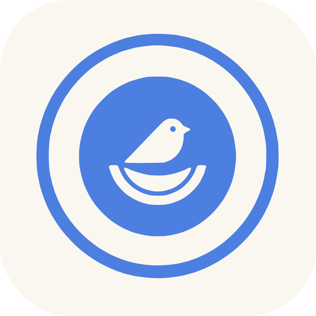
A small bird held inside a nest, ringed in Nest Blue. Care, kept close.
The wordmark
Fraunces, weight 500, tight tracking. 'Nest' always in Nest Blue.
The palette
Five colors. Nest Blue carries the trust — use it sparingly so it keeps its meaning.
--primaryThe trust color. Reserved for the mark, links, and one primary action per view.
--foregroundPrimary text. Editorial weight without shouting.
--backgroundCanvas. Warmer than white — carries the feeling of a family space.
--accentWarmth accent. Only in illustration, never as an action button.
--primary-softSoft washes and chip backgrounds.
Typography
Fraunces for editorial voice. Inter for interface. Plus Jakarta for display headings when serif is too soft.
Runtime badge
Quiet attribution for shared cards, screenshots, and moments that leave the app.
Downloads
Hand-authored SVG. No raster fallbacks needed.


Voice
How we write, so the app feels like a note from a friend — not a product marketing to a user.